1. 等腰三角形
使用场景:悬停到导航栏的某个li
原理:
// 宽高必须是0 !!!
.box1 {
    width: 0;
    height: 0;
    border: 10px solid transparent;
    // 只改某一边的颜色:
    border-top-color: blue;
    // 兼容低版本浏览器:
    line-height: 0;
    font-size: 0;
}
transparent: 透明的。
2. 直角三角形
使用场景:制作梯形时,例:
原理: 和上面类似,图解:
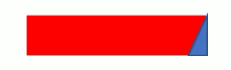
.box2 {
    width: 0;
    height: 0;
    // 上边框取高点,撑起盒子高度:
    border-top: 100px solid transparent;
    border-right: 50px solod skyblue;
    // 下面这行可以让一个正方形的4个三角变为3个:
    // 左边和下边的边框宽度必须为0:
    border-bottom: 0 solod blue;
   border-left: 0 solod green;
}
上面的代码简写为:
.box2 {
    width: 0;
    height: 0;
    border-color: transparent skyblue transparent transparent;
    border-style: solid;
    border-width: 100px 50px 0 0;

}